simpleSIGN - a parking system that aids visitors driving to the Melrose & Fairfax area so they can park without worry.
Design Team: Sofia Nilsson, Maddi Nielsen, Lisa Skibinskaya
SIMPLESIGN PROTOTYPES
UNDERSTANDING
PROBLEM - Melrose & Fairfax is a trendy destination for lovers of food and streetwear clothing. The area is adjacent to the residential streets and right by Fairfax High School, which makes this destination hard for visitors to travel to by car as there are few parking options. Street parking is highly regulated, and often, visitors can get confused by the multiple stacked signage.
INSIGHT - During our interviews with visitors to the area, we found that the main parking problem had to do with signage. We found signs often hard to read due to defacings, such as graffiti or stickers. Or the stacked signs were too hard to understand.
SOLUTION - simpleSIGN aids visitors coming to the area with a quick understanding of parking rules so they can park without worry. There are three parts to simpleSign: first, we have a large, digital sign that changes throughout the day, immediately showing if someone can park there at that time. There is also a static schedule underneath for a full view of the week's rules; lastly, we have a companion website where visitors can find more information.
How might we help visitors coming to Fairfax & Melrose quickly and easily understand when and where they can park?
MY ROLE:
User Research
Product Research
UX/UI
Wireframe Design
Visual Design

DESIGN PROCESS
OBSERVATIONS
Early on, after doing our field research, we asked visitors and employees in the area what mobility issue they had faced and realized that parking was the main problem. To learn more about these problems, we headed out to Fairfax and Melrose once again to interview visitors and pinpoint parking issues in Fairfax and Melrose.
INTERVIEWS
We went out and conducted interviews with both visitors and employees on Fairfax and Melrose. After conducting our interviews and gathering more information, we could determine that the main problem with parking in the area was signage. We interviewed a total of 7 people during our first interview round, and this is what some of the interviewees in the area had to say:

“The most confusing signs … it'll be like contradicting signs. Like all in one. You're just like, I don't know if I can park here at all.”
- Kayla & Monica, visitors
“When they add multiple layers to it [signage], and that's like, alright, like, where are we? What time is it? Can I park here?”
- Amir & Kai, visitors
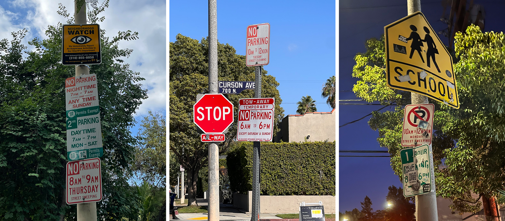
MOST COMMON SIGNAGE ISSUES
KEY INSIGHTS
After conducting our field research and interviews, we identified the following key insights:
- Multiple stacked signs were confusing and hard to understand.
- Multiple posted signs were confusing and contradicting.
- Many signs were defaced with graffiti or stickers, making them illegible.
PROTOTYPE DEVELOPMENT
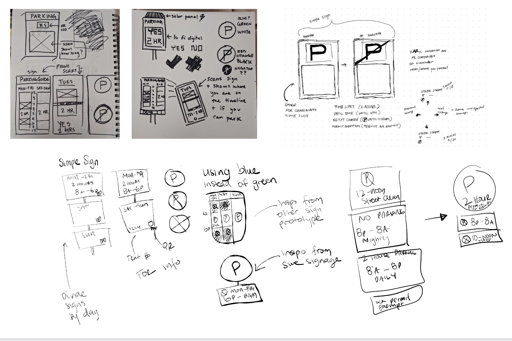
FIRST PROTOTYPE SKETCHES
From sketches to reality
Our team worked together to sketch and create different solutions to our problem. This was our first step in creating a prototype and finding the best solution. We all presented different designs and ideas and combined these into two prototypes - one sketch design was for the physical sign that drivers parking would see, and the second was for a website or app.
We then combined the best ideas to create lo-fi prototypes to be tested on our users in person.
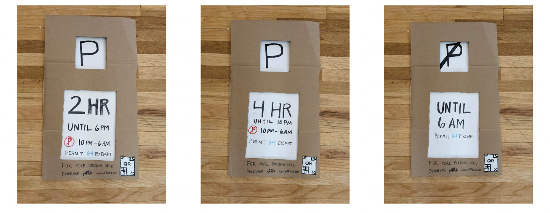
FIRST SIGN PROTOTYPE IN CARDBOARD FOR USER TESTING AND FEEDBACK
LO-FI WIREFRAME
The Lo-Fi wireframe was our first iteration of an app or website design for simpleSIGN. We had identified key features from our interviews that we wanted to include, such as a language selection, the ability to clarify the parking sign, a parking expiration timer or reminder, and the ability to know where you are parked by including a map feature to help you know where you are, and later find where you parked your car.
SIMPLESIGN LOFI-WIREFRAME FOR WEBSITE/APP DEVELOPMENT
IN-PERSON PROTOTYPE TESTING
During our first round of prototype testing, we utilized our Lo-Fi prototypes of the signage and presented them to our testers to find out what features they liked, did not like, and wished they had. This was a crucial turning point for us as the AI idea we had initially explored was not amongst the tester's favorites. They favored a sizeable clear sign that was easy to read and understand. With that information, we designed three signs with different wording to see what our users favored in the second round of user testing.
REMOTE PROTOTYPE TESTING
During our remote prototype testing, we tested our website and its functions with users. We would send them our link to our prototype and ask them questions while they guided us through the experience. We also asked them to share what they liked, did not like, and wished they had, along with feedback on the functions. With the insight of our users we came to terms with the key features that were needed on the simpleSIGN website.

Solution
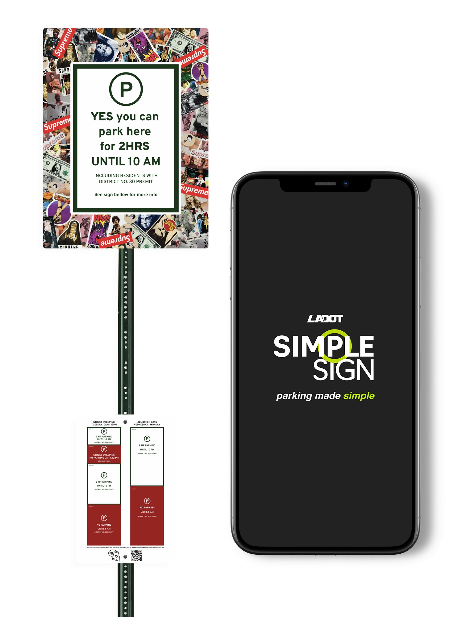
simpleSIGN Digital Sign
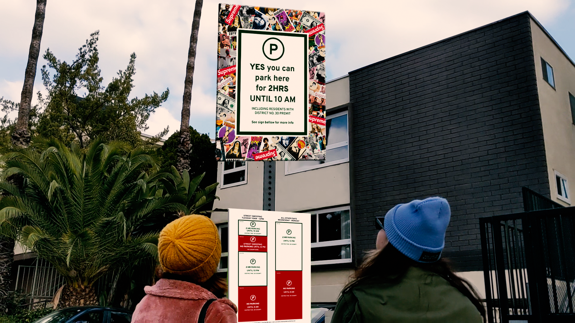
The digital sign is made to be read quickly and easily from a moving car. When we observed the signage in the area, we noticed some of them were completely illegible; with simpleSign, a border was added to create space for advertising or art that won’t interfere with the readability of the signage. User testing favored a clear and easily read sign with a clear information hierarchy.
When designing, we looked at the current parking signs in the area and used the most important and relevant information for Simple Sign. A universally understandable parking symbol, if and when you can or can not park, includes exceptions to the rule, such as permits, and calls attention to the static sign underneath.
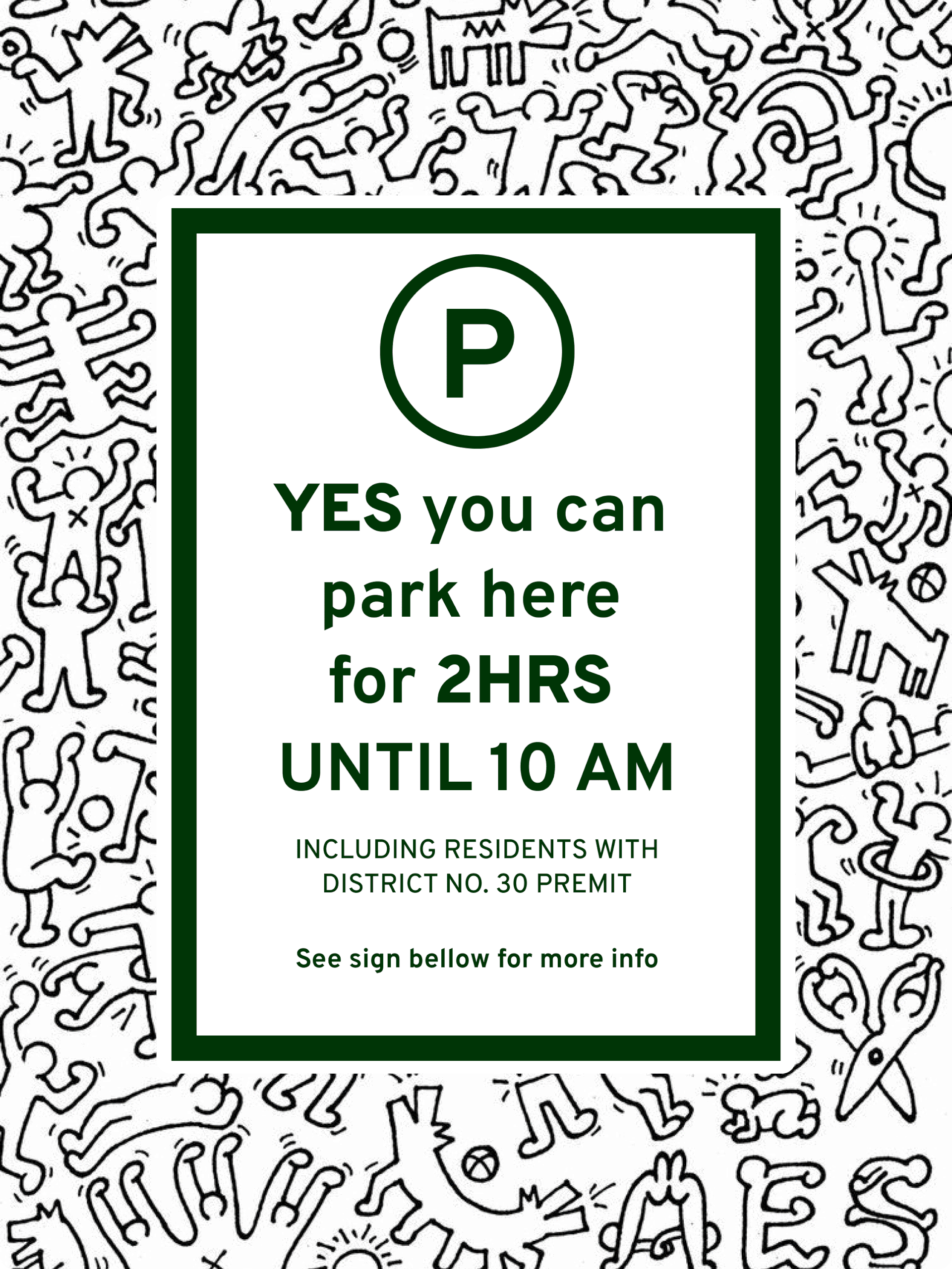
SIMPLESIGN DIGITAL SIGN - CHANGING DURING THE DAY AND CHANGEABLE ADVERTISING BORDER

simpleSIGN Static Schedule
During our interviews, this version of a parking sign was favored amongst all users. So, we created a static schedule sign to accompany the main digital sign. It gives the user an overview of the daily parking times and rules if something is unclear or they need to plan ahead.
It shows a weekly parking schedule that is divided based on the changes that happen throughout the week. Each day is also split up based on when the parking rules change. At the bottom of the sign, we added three ways of accessing the website: a QR code, an NFC tap, and a link; all take you to simpleSIGN’s website for more information.
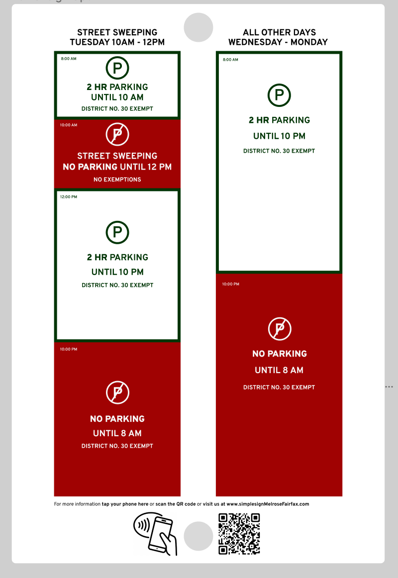
SIMPLESIGN STATIC SCHEDULE SIGN
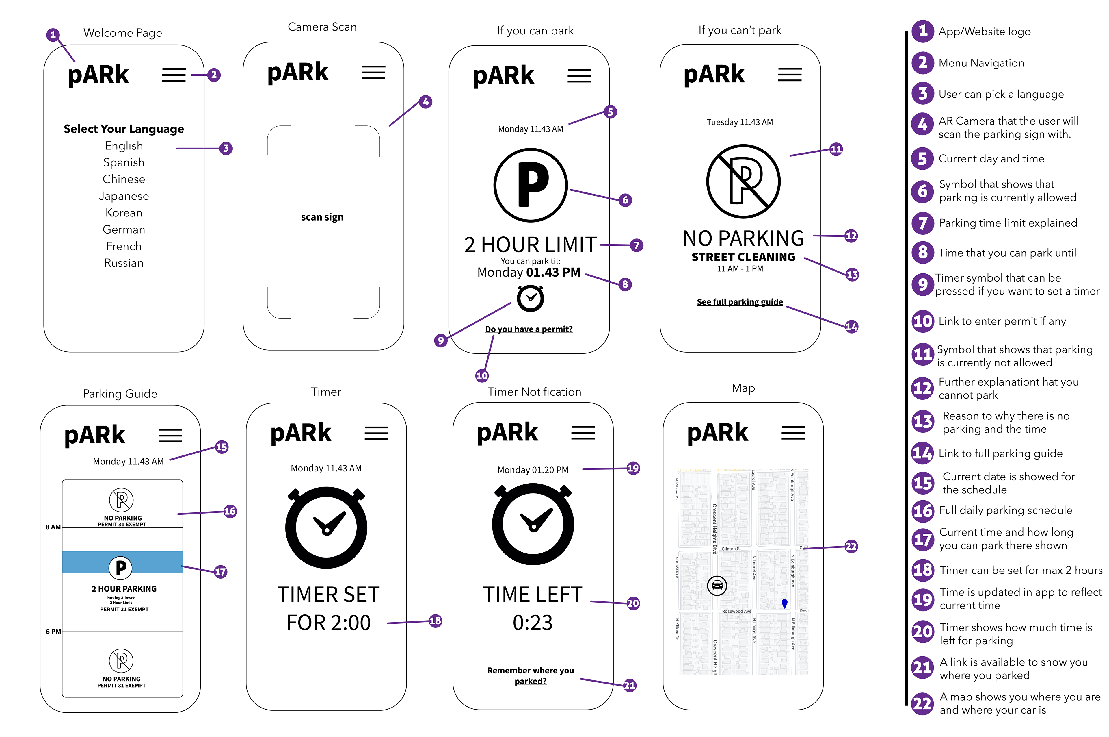
SIMPLESIGN WEBSITE PAGES
simpleSIGN Website
When designing our website, we asked ourselves, what functions do our users need? We decided on these four main functions to improve visitors' parking experience:
Language - The first thing appearing on the website is a language selection. As international travelers visit Fairfax & Melrose, we found it essential to be able to interpret the parking sign in their native language.
Parking Availability - You can double-check if you can park at your location and find available parking nearby if parking where you currently are is unavailable.
Expiration Reminders - Once you have found a parking spot, you can choose to get an SMS notification reminder before your parking expires. You can get the notification 15, 20, or 30 minutes before your time is up.
Signage Explanation - If you still have trouble interpreting the sign, you can get further information on the help page, which clarifies what different parts of the sign mean.
WATCH SIMPLESIGN IN ACTION
SO, WHAT comes NEXT?
The next step for simpleSIGN would be to explore whether the digital part of the sign is feasible. We had not considered the electrical costs that come along with that and what would happen if it, for some reason, breaks. I want to explore other options or energy resources, such as solar or what a static version that is not digital may look like instead. We had considered an AI function, but we are still unsure what role that would play for the parking sign as a large visible sign is still needed for drivers to see from their cars.
As designers, we must consider every aspect of what we are designing and how and what impacts it may have. Switching a static item to a digital one may not be the best move, but if it is helpful enough and can be automated, it may save more money and time. Our project is to create solutions so that others can have an easier life.
I learned a great deal from this project, and although we had our struggles throughout the semester, we finally came together as a team and created a solid product that we are proud to present. And even more excited to develop further if we have the chance. I wish we had more time to develop our prototype further, as a large portion of the last weeks were dedicated to creating our video, which took away time from the project development.